Examples of new visual identity components
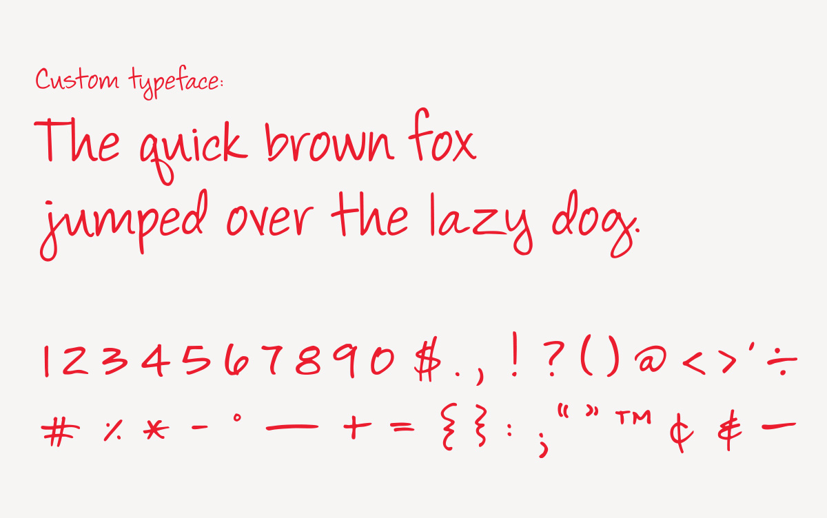
Custom handwritten secondary typeface
New marketing photography

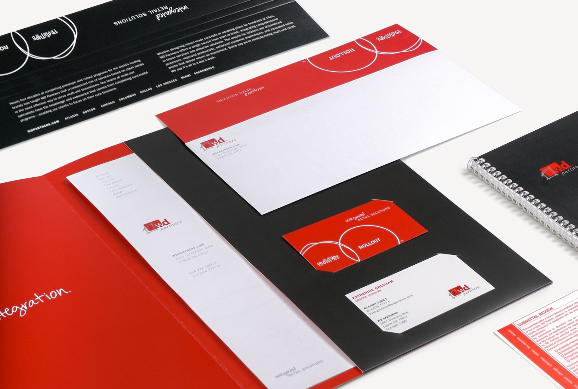
Visual brand language & marketing collateral
While at WD Partners, a retail design and architecture firm for national multi-unit brands, I was the lead designer in the effort to evolve the company's visual identity. The WD logo ultimately remained untouched, but the primary and secondary color palettes were refined, a handwritten typeface was created to complement the brand's primary typeface, and graphic elements were developed to further expand the visual brand assets. Guidelines for the type of marketing photography that could be used were also established. All internal and external company materials were subsequently redesigned, samples of which can be viewed below.
Custom handwritten secondary typeface
New marketing photography
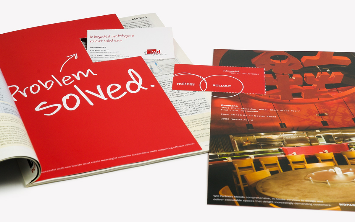
Stationery system, including submittal review stickers and binding strips designed to be used when submitting architectural and engineering drawings to the client.
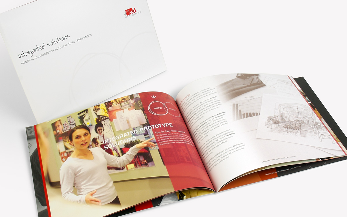
Perfect bound company overview brochure
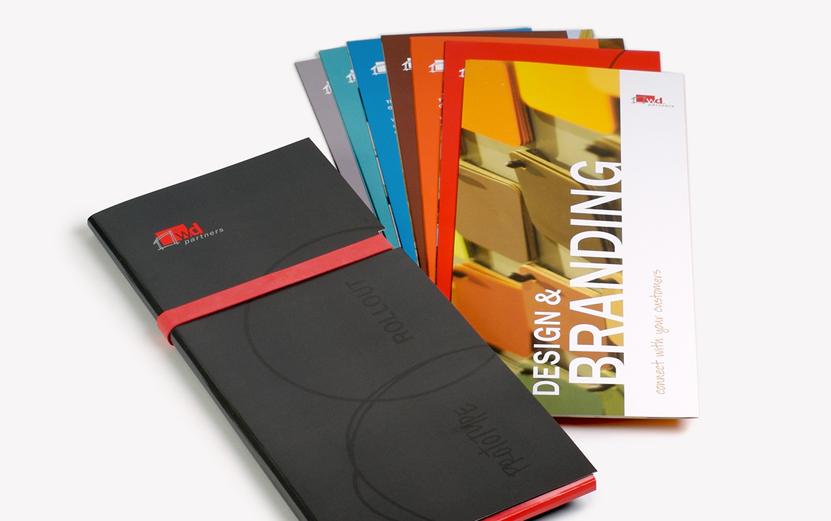
Service offering brochures and adjustable case
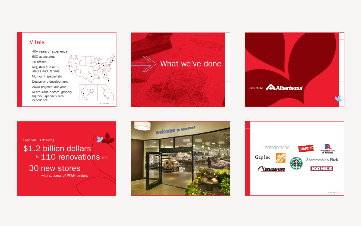
Business development presentation slides
Magazine ad to create brand awareness
Magazine ad to promote the opening of the India office
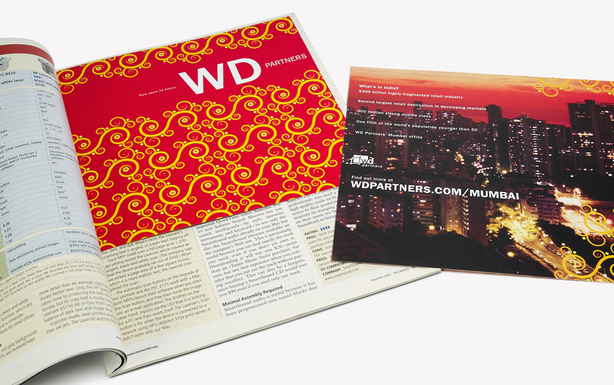
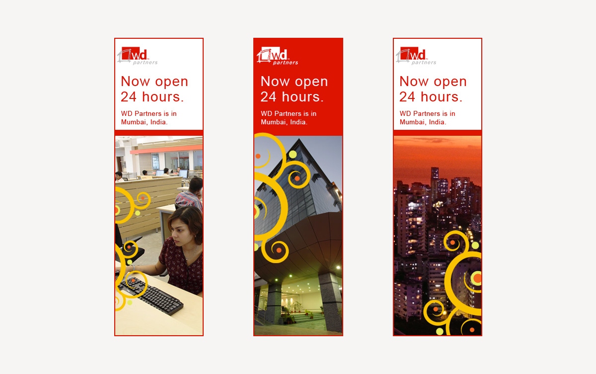
Digital ad to promote the opening of the India office
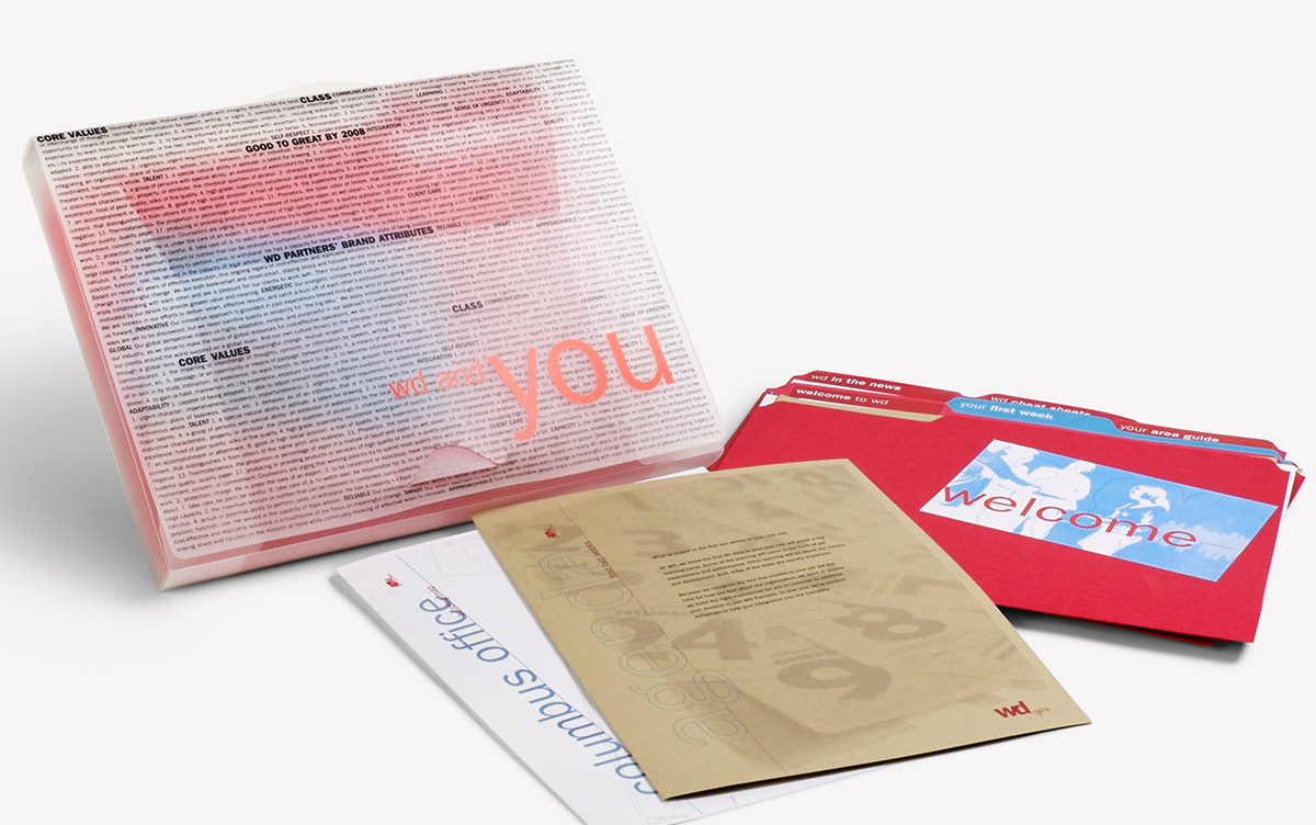
New associate onboarding kit